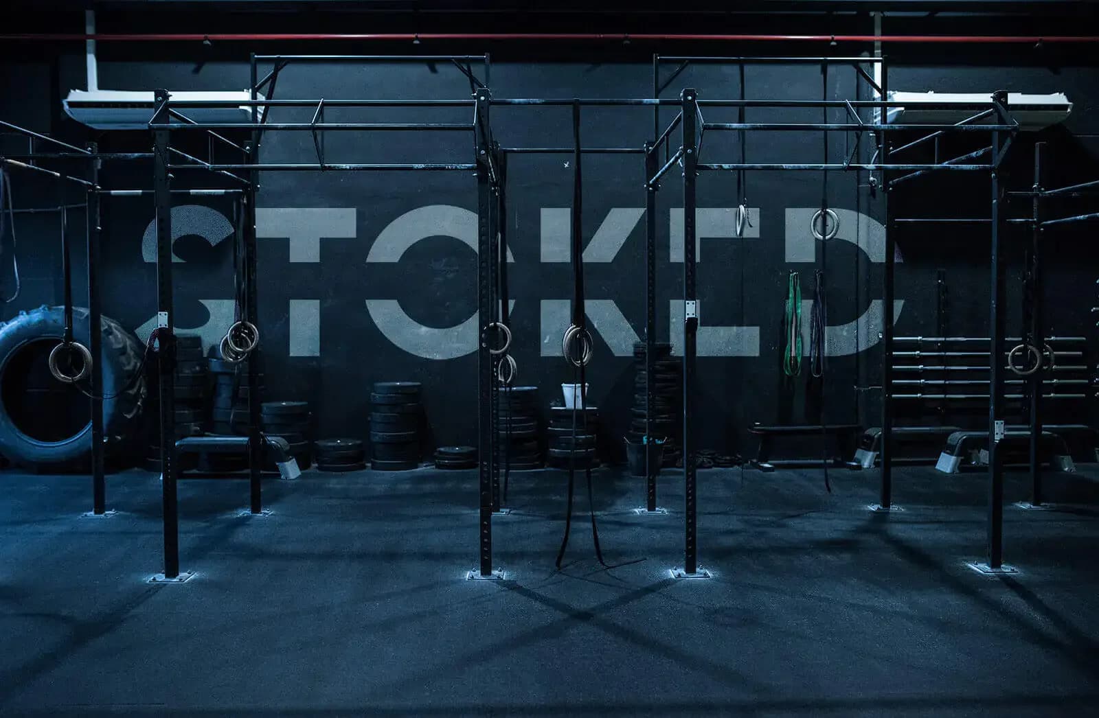
Stoked Crossfit.
Branding & website · Stoked Crossfit · 2024
The project in short.
A full rebrand and website for an energetic crossfit community in Amsterdam. From logo to merchandise: a strong brand that inspires athletes.
From challenge to approach.
The challenge
Stoked Crossfit wanted a powerful visual identity that carries the energy and the community spirit of their box. The existing brand felt dated and did not speak to a younger audience.
The approach
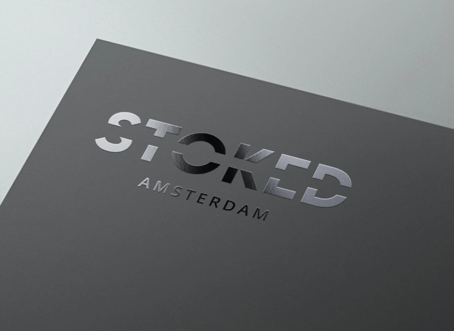
We built a bold, modern brand with a dynamic logo that radiates strength and movement. The black and white base with bright accents mirrors the intensity of crossfit, while the typography gives it an industrial edge.
What it delivered.
150% more social media engagement
40% rise in new member sign-ups
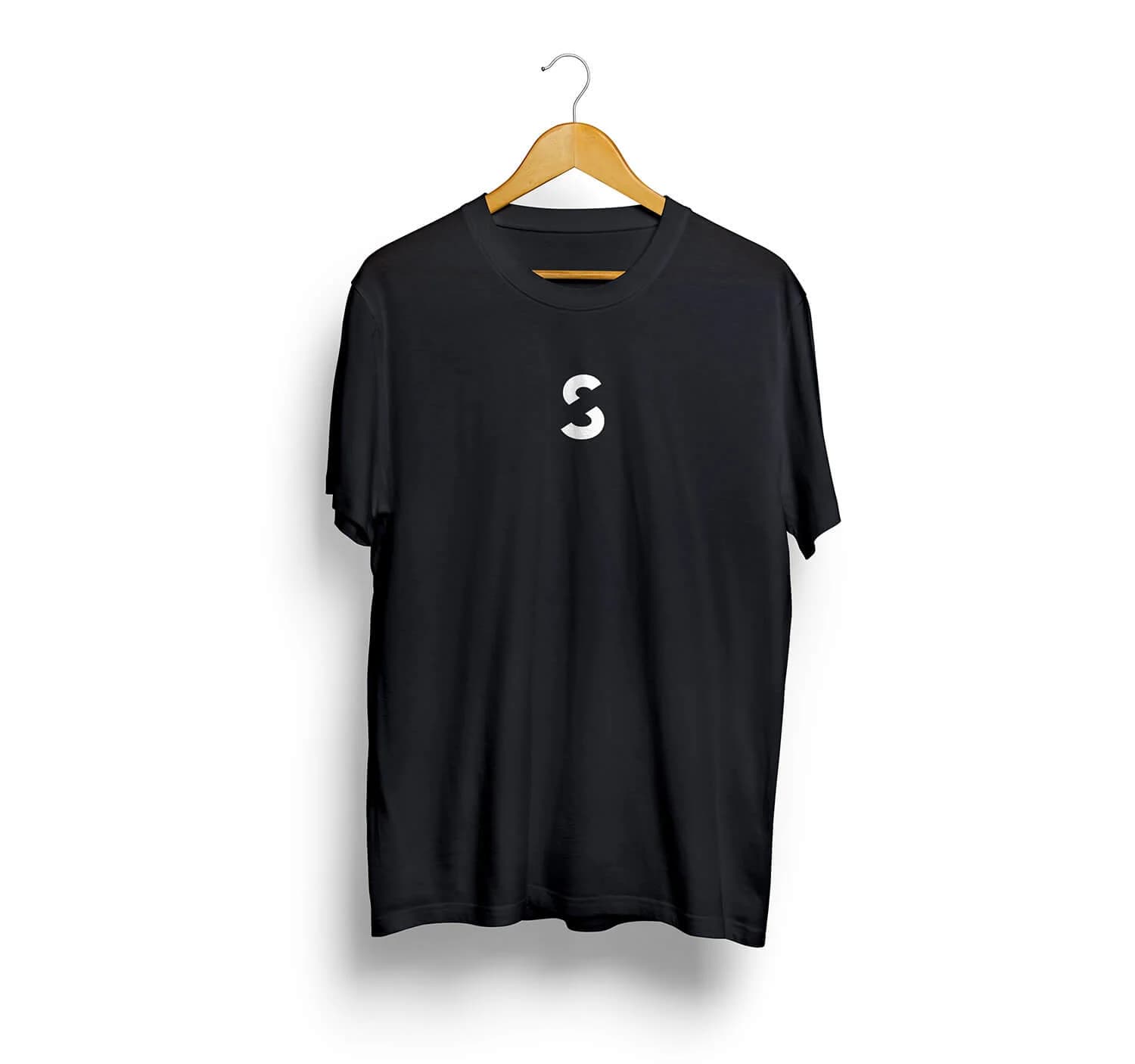
Merchandise became a bestseller in the community
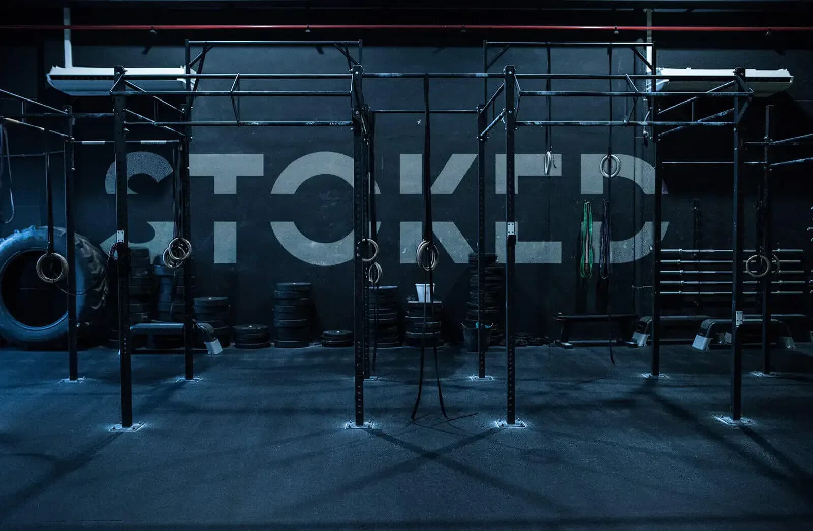
The brand in pictures.


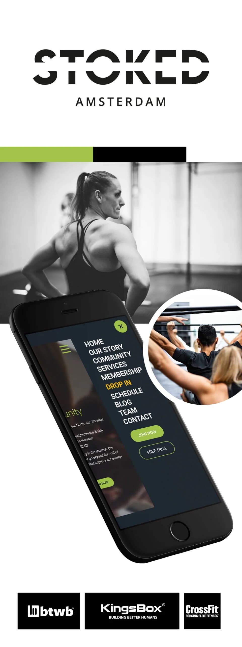


The website and the AI behind it handle the WhatsApp messages and the follow-up mails: it all runs by itself.
A must for any business owner!

A project like this
for your brand?
Tell us what you want to achieve and we will think along right away.